The Complete Prestige 12″ Jazz Catalogue 1988

Arnaud Maggs, The Complete Prestige 12” Jazz Catalogue (detail), 1988
828 azo dye prints (Cibachrome), 20.3 x 25.4 cm (each)
National Gallery of Canada, Ottawa
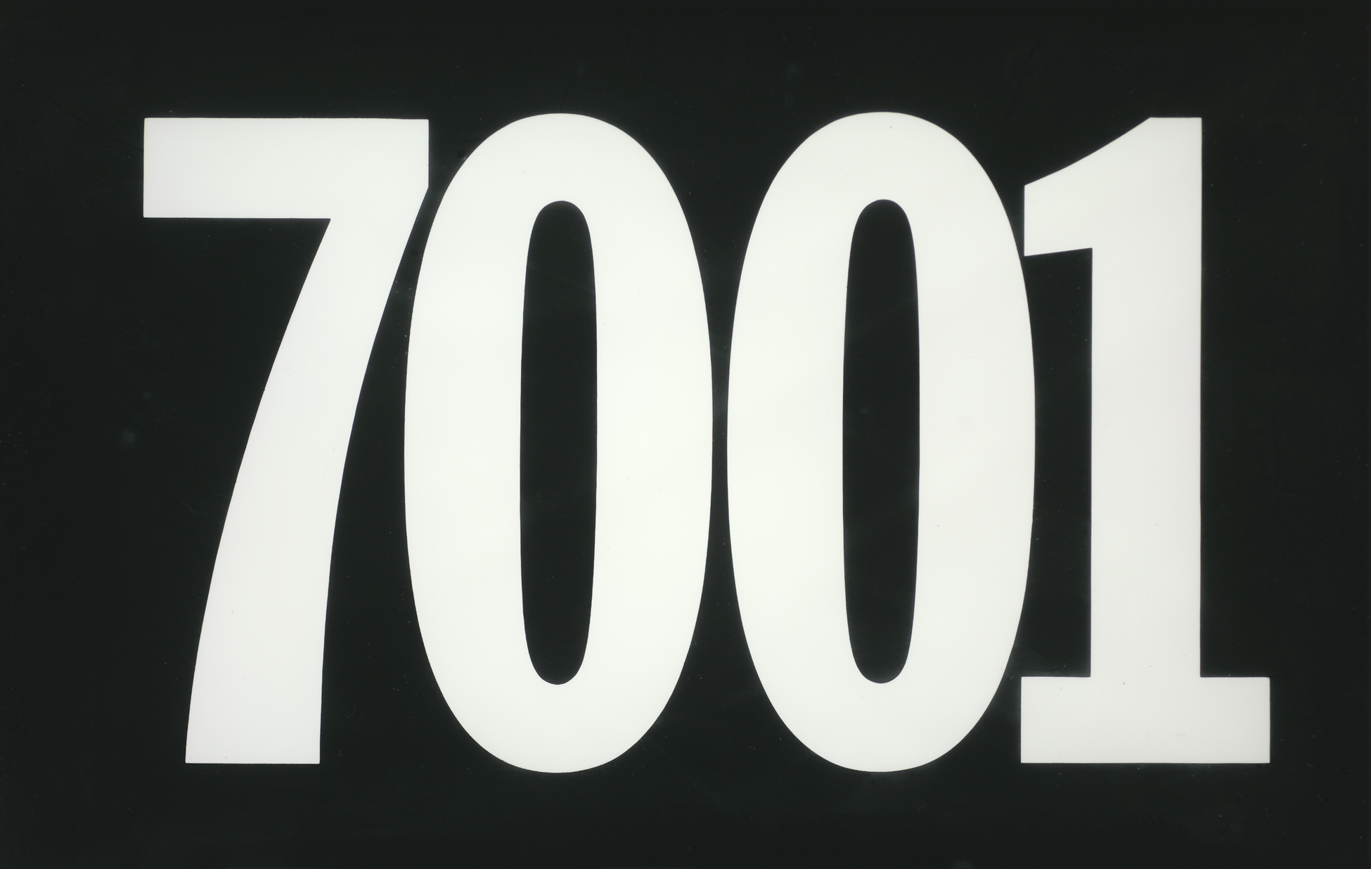
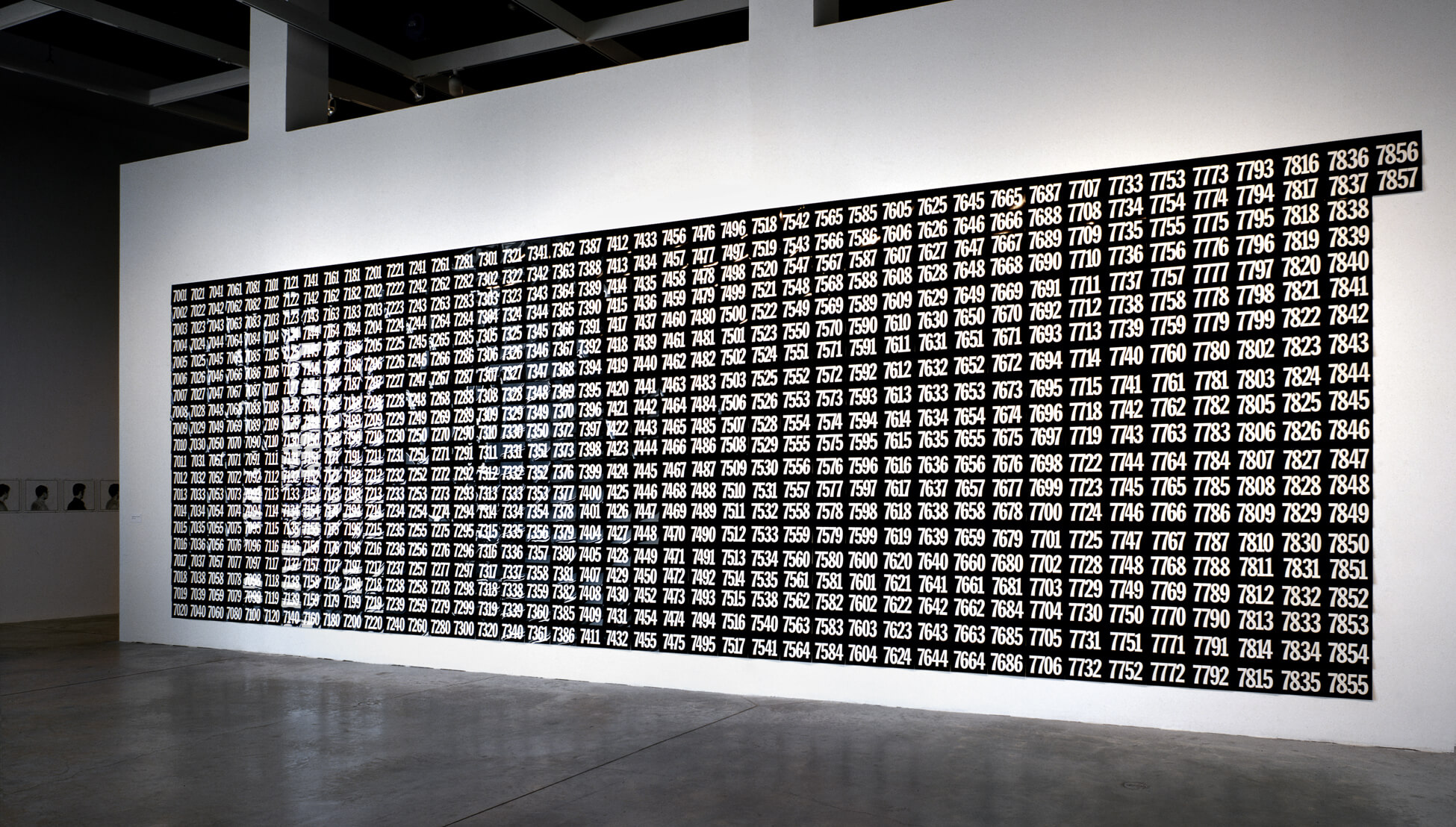
The Complete Prestige 12” Jazz Catalogue comprises 828 8-by-10-inch Cibachrome prints of the four-digit numbers used to catalogue the 7000 series of 12-inch vinyl jazz albums put out by Prestige Records in New York City. The work brings together Arnaud Maggs’s interest in graphic and typographic forms and collecting, revealing an archival impulse that has come to define his oeuvre. It marks an important shift away from the human subject, yet maintains Maggs’s emphasis on systems of identification and classification, themes that can be seen in earlier works such as 64 Portrait Studies, 1976–78, and Ledoyen Series, Working Notes, 1979.

Bemused by the seemingly arbitrary nature of some catalogue numbering systems, Maggs decided that in this work he would draw attention to the system used by the Prestige record label. His strategy was to emphasize the numerical signifiers rather than the jazz works. As he asserted, “I made the cataloguing system assume more importance than what it’s cataloguing.” His focus on numbers and the associations to music evokes the work of German conceptual artist Hanne Darboven (1941–2009), whose similarly monumental and exhaustive works extend the language of Minimalism and visualize time using numerical coding.
Each rectangular print of The Complete Prestige 12” Jazz Catalogue features four large, white numerals set in Franklin Gothic Condensed on a black ground. Maggs’s typographic approach recalls his minimalist cover for the 13th Art Directors Club of Toronto Annual (1961), which features the number 13 in large black characters on a white ground. Although effectively black and white images, The Complete Prestige 12” Jazz Catalogue is produced using Cibachrome, a colour process. Maggs joked that the work was his first “foray into colour.”

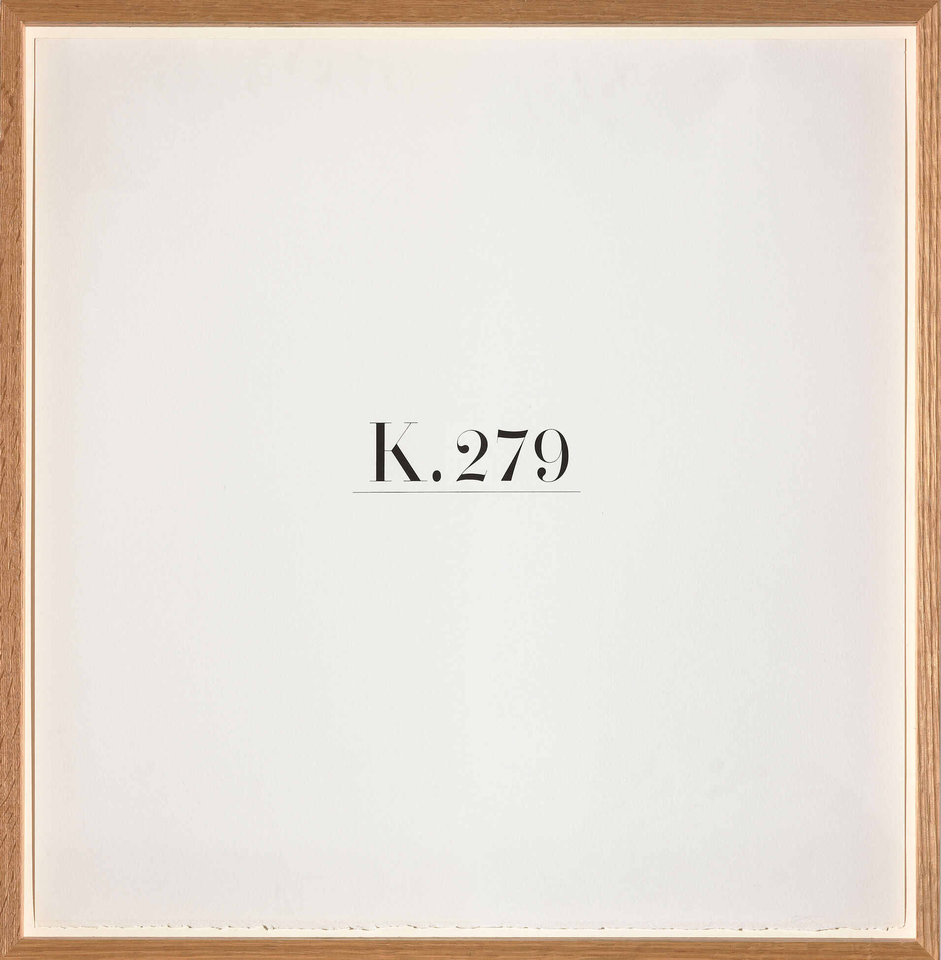
Maggs’s Köchel Series, 1990, functions similarly to the Prestige collection in that it too represents an existing catalogue record. His subject was the Köchel catalogue (Köchel-Verzeichnis), a numbering system devised by Austrian musicologist Ludwig von Köchel (1800–1877) for chronologically ordering all of Mozart’s compositions. By assigning each one with a K or a KV number, Köchel catalogued more than six hundred pieces of music, but Maggs defined limits for the works in his series. Just as he did with his portraits, Maggs signals these parameters in his titles: Köchel Series: Eighteen Piano Sonatas (for Ed Cleary) and Köchel Series: Six Quartets Dedicated to Haydn.
The Complete Prestige 12” Jazz Catalogue and Köchel Series demonstrate the productive interweaving of Conceptual art and graphic design: here typography is critical to the system that defined the work. In each Köchel Series print, a single K number—K.279, for example—is set in a modern serif typeface, underlined, and letterpressed in black ink on white rag paper. The work was created in the years Maggs moved away from photographic portraits to explore number- and letterforms. He worked with Canadian graphic designer and typographer Ed Cleary (1950–1994) on the typography and dedicated Köchel Series: Eighteen Piano Sonatas to Cleary.
The Complete Prestige 12” Jazz Catalogue engaged Maggs’s analytical interest in the relationship between the individual frames and the work as a whole. First shown at YYZ Artists’ Outlet in Toronto in 1988, the large-scale, grid-format installation measured approximately 11 by 38 feet. Each print was unframed and attached to the wall at the top using tape. “They’re sort of hung like shingles,” Maggs explained. “The second one hides the tape of the first one.” The installation is subtly interactive, rustling lightly as visitors move around the gallery and the air circulates. Akin to the rotational ripple that moves through Maggs’s André Kertész, 144 Views, 1980, the movement of the prints enlivens the grid and the record.

 About the Author
 More Online Art Books
 Acknowledgements