Once he caught fire as an artist, Tom Thomson created new and startling colours; primed his canvases and sketching panels with an eye to his planned compositions; used ideas and motifs from other art movements that appealed to him; and grappled with subjects in original and durable ways.
Diverse Influences
In the early 1900s in Toronto, Thomson had no opportunities to see first-hand what was going on in Europe or even in New York—a city he never visited. The art he was exposed to came in the form of reproductions in The Studio: An Illustrated Magazine of Fine and Applied Art and other art magazines, or was filtered through the interpretations of art movements by his colleagues, the future members of the Group of Seven, all of whom were trained in art and art history.
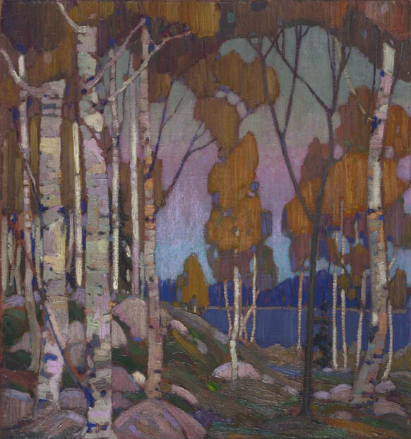
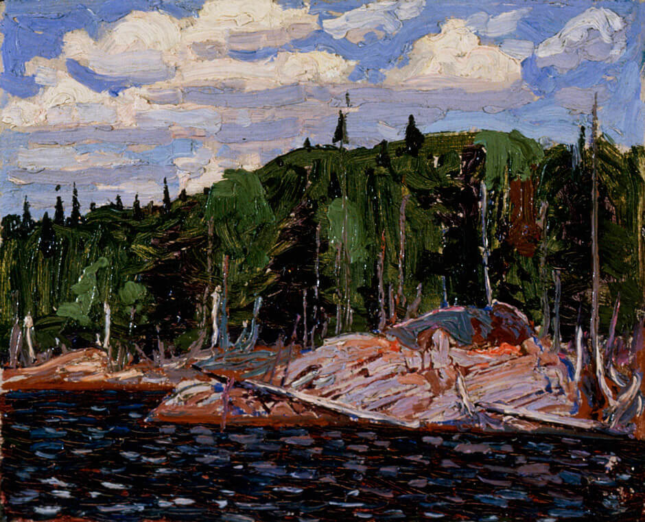
Consequently, what we find in Thomson’s work are smatterings of many earlier art movements: Impressionism, Expressionism, Art Nouveau, Arts and Crafts motifs, stray examples of American versions of French Impressionism, and Victorian and Edwardian English landscape traditions. The Pointers, 1916–17, shows Thomson flirting with Impressionism, for example, while The West Wind, 1916–17—especially the foreground and the sinuous branches of the tree—draws on Art Nouveau. Thomson’s nod to Expressionism crops up most strongly in 1916 and 1917 as he moves toward abstraction in such works as After the Storm, 1917 and Cranberry Marsh, 1916.
Any art books or magazines that floated into Thomson’s view would have had mostly black and white images. From the various influences he eagerly absorbed, he received a wealth of possibilities, none of which, however, reflected the vital modernist movements (Cubism, the Fauves, Surrealism) that had been roiling through Europe during the two decades before his death in 1917.
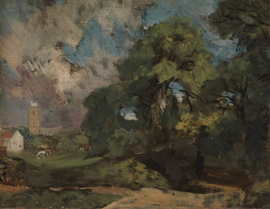
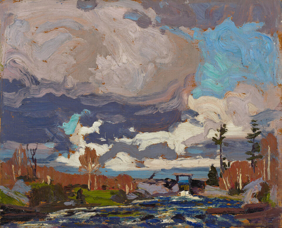
In works such as Approaching Snowstorm, 1915, Thomson was drawn to the English landscape painter John Constable (1776–1837), who had been introduced to him by Arthur Lismer (1885–1969) and J.E.H. MacDonald (1873–1932). Constable was the first artist to approach the landscape not just as a painting genre but as an experience of a natural event—a rainstorm, a brilliant rainbow, an unusual cloud formation, a misty sunrise. In this respect, he and his contemporary William J.M. Turner (1775–1851) rewrote the rules for landscape painting. In 1888 a critic described Constable’s small oil sketches as “faithful and brilliant transcriptions of the thing of the moment—nature caught in the very act.” He might have been writing of Thomson’s small sketches almost three decades later.

Closer to home, however, MacDonald was the senior artist of the coterie, and his influence on Thomson was perhaps most critical of all. His own fascination with storms, cloud formations, and the effects of nature are similar in their feeling to Thomson’s, and his bravado in colour choices was daring and original too—as in The Tangled Garden, 1916, which caused a real rumpus with critics. Lawren Harris (1885–1970) was probably next in importance for Thomson: his example can be seen in The Jack Pine, 1916–17, with its simple and dramatic composition and thick, long slabs of pigment.
Thomson had the gumption and good sense to seize and ingest whatever he needed from these multiple sources and to adapt them to the landscape he knew best. This instinctive impulse made his work ring true and imbued it with power. It also helped him to make art that, while complicated, sophisticated, and original, was also accessible. His work remains fresh for each generation.
Commercial Art
Alone among his friends in the future Group of Seven, Thomson had not enjoyed a good art-school education. However, except for Lawren Harris (1885–1970) and A.Y. Jackson (1882–1974), they all worked as commercial artists. With his training and experience in advertising, commercial design, and printing, Thomson had a strong background in illustration before he began to paint seriously.
Thomson spent most of his adult life, 1902–13, working for design and photo-engraving firms, first in Seattle and then in Toronto. Grip Limited, where he was employed for three formative years, 1909–12, was the leading graphic design company in the city. It introduced the Art Nouveau style to Canada, along with metal engraving and the four-colour process. Yet, in all his years as a commercial designer, Thomson was never able to draw the human figure successfully. Unlike his colleagues Arthur Lismer (1885–1969) and Fred Varley (1881–1969), whose art-school training prepared them to be “figure men” at Grip, Thomson’s lack of skill in this area stayed with him all his life. His few paintings that include figures (In the Sugar Bush, 1915, Larry Dixon Splitting Wood, 1915, Figure of a Lady, 1915, and The Fisherman, 1916–17) are among the most awkward, wooden, and expressionless of his entire production. Only in his last four years was Thomson able to devote himself entirely to making art, after Dr. James MacCallum’s support in 1914 launched him into a career of painting full time.
Thomson’s debt to commercial art surfaced occasionally in his work: in the decorative Art Nouveau style he used in some of his paintings, such as Northern River, 1914–15, and The West Wind, 1916–17, and in compositions such as Decorative Landscape: Birches and Spring Ice, both 1915–16, where he places a grouping of trees in the foreground to frame a view across a lake of low hills in the background—a layout he had used earlier in his design work. As Jackson put it, “We treated our subjects with the freedom of designers. We tried to emphasize colour, line and pattern.” In Forest Undergrowth I, II, and III, the panels Thomson painted over the winter of 1915–16 for MacCallum’s cottage on Georgian Bay, this decorative influence becomes overwhelming and unoriginal.
An Idiosyncratic Palette
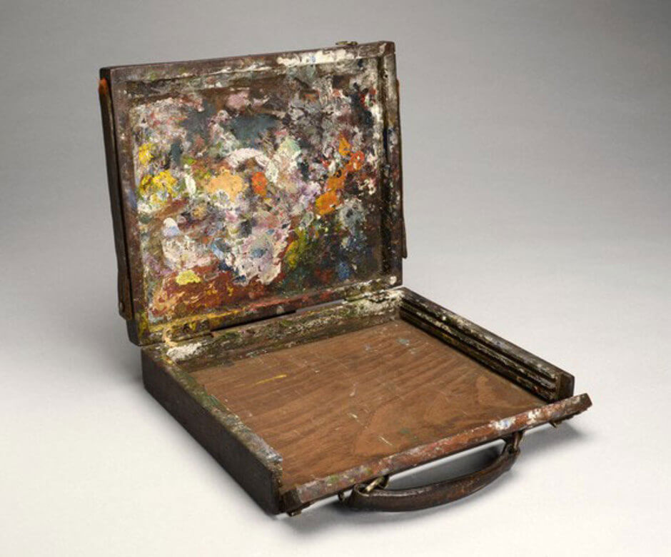
As Thomson learned the basics, he quickly began to experiment. He tried different kinds of pigments, such as Freeman’s white lead, a pure-white composite that his colleagues hardly used at all. He experimented with the composition or structure of each painting—and rarely repeated a pattern.
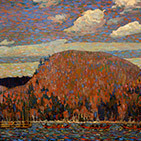
More striking was his idiosyncratic palette, his manner of mixing available pigments to make unusual new colours, as in Pine Trees at Sunset, 1915, with its radiant acid-green and yellow sunset, and Cranberry Marsh, 1916, where its field of brilliant light resembles burning sunshine. His patron Dr. James MacCallum thought him “the greatest colourist of the Algonquin School” (as Thomson and his artist friends were initially referred to).
Even more surprising is how Thomson makes unreal colours stand in for what was actually there: a bluish-pink to represent snow in Early Snow, Algonquin Park, 1916, a deep teal-lapis lazuli-greenish-blue for a patch of swamp water in Cranberry Marsh, a yellowish-green arc in the sky above a violent red sunset in Sunset, 1915. Thomson’s control of colour is exceptional, a mark of his growing success and confidence. Moreover, his colours and his brushwork are instantly recognizable and as personal as a fingerprint, regardless of the subject or the season he tackles.
In the majority of his sketches, Thomson uses fairly short, energetic, and abrupt strokes, with a few gentle arcs added as final touches. The direction of his brush is expressive: in The Pointers, 1916–17, the strokes are mostly horizontal in the water and the sky, but vertical on the hills. By the last year of his life, however, Thomson was punching his colours onto his panels in all directions with a vigorous brush, as in his sketch After the Storm, 1917. This aggressive but intense kind of painting is indicative of Thomson’s transition from illustration or representation to a form of expression that was starting to border on Abstract Expressionism. But, like David Milne (1881–1953), Emily Carr (1871–1945), and others of his generation, Thomson didn’t advance far enough to relinquish representation entirely, even though he was moving in that direction.
Surface Preparation
Thomson experimented almost casually with different surfaces or supports for his paintings. He used wood panels most often, but also canvas-covered boards, commercial pressed-paper boards, illustration card, cigar-box lids, and even plywood, which, sadly, deteriorates over time into the separate layers of composite veneer from which it is made. As far as is known, he never used Masonite, a later favourite for many artists.
In the lead-up to the major travelling retrospective, Tom Thomson, organized by the National Gallery of Canada, Ottawa, and the Art Gallery of Ontario, Toronto, in 2002–3, the Canadian Conservation Institute undertook a major analysis of Thomson’s paintings using infrared and X-ray photography, spectrometry, and micro-sampling of pigments. In their catalogue essay about what was learned through this intensive work, Sandra Webster-Cook and Anne Ruggles describe how Thomson applied primers in different colours to different parts of his compositions in order to give subtle but important qualities to his paintings.
Most painters prime a canvas with a coat of lead white, gesso, or some mixture of a neutral pigment and animal glue (rabbit was a favourite in Thomson’s day and, in some circles, still is). This “foundation” adheres to the canvas or board, holds the pigments to the surface, and acts as a buffer that keeps the pigments of the painting from being partly absorbed, altered, or leached over time by chemicals in the canvas or panel. This detailed information on Thomson’s methods and materials has greatly advanced the ability of scientific analysis to detect Thomson forgeries, of which a goodly number exist.
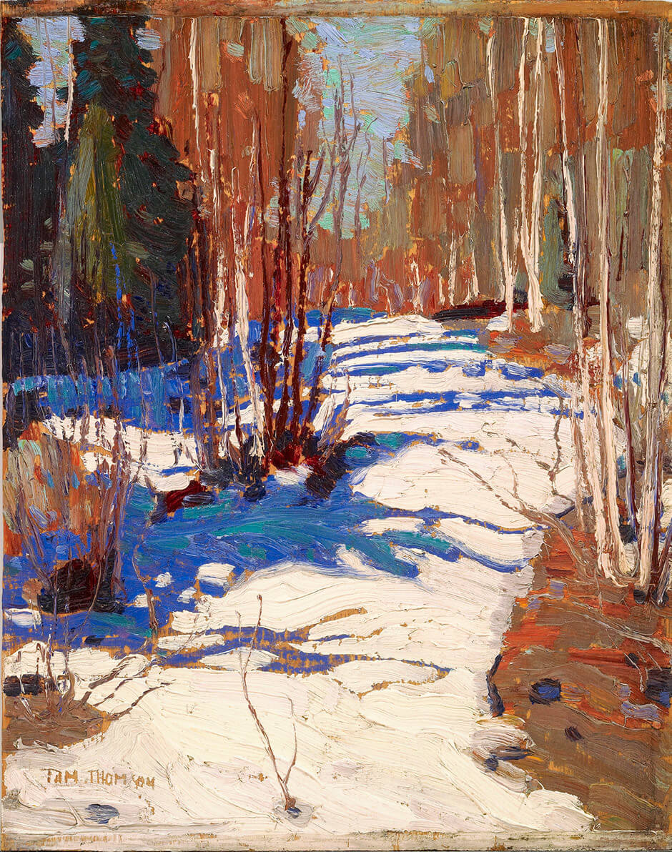
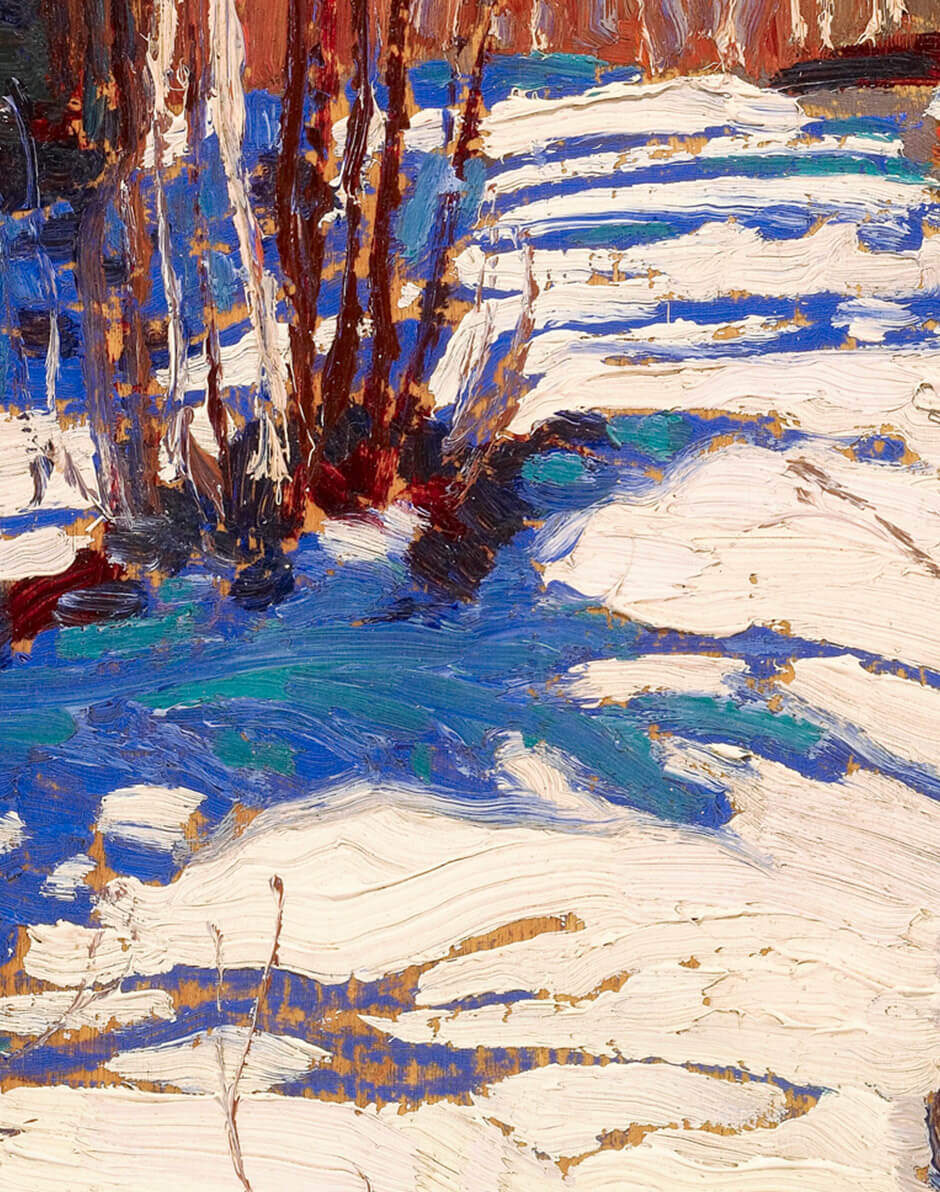
Early on in his painting career, Thomson realized that oil paintings, large or small, are made in a reverse fashion. The first colours to be applied are often buried below subsequent layers of paint, while the last colours to go on become the surface of the finished work and are the first colours we see. The underlying pigments, though, give subtle (and sometimes not so subtle) qualities to those above them. Thomson sometimes used more than one primer in his compositions: in Lakeside, Spring, Algonquin Park, 1915, he used a grey-pink tone overall, but deep red under the water. Other times, as in Path behind Mowat Lodge, 1917, he sketched on a bare wood panel and allowed tiny patches of the wood to peep through. These devices helped create variations in the light in the painting. They would be almost invisible to most viewers but critical to someone as scrupulous as Thomson.
 About the Author
 More Online Art Books
 Acknowledgements