First Snow in Autumn 1916

Tom Thomson, First Snow in Autumn, 1916
Oil on panel, 12.8 x 8.2 cm
National Gallery of Canada, Ottawa
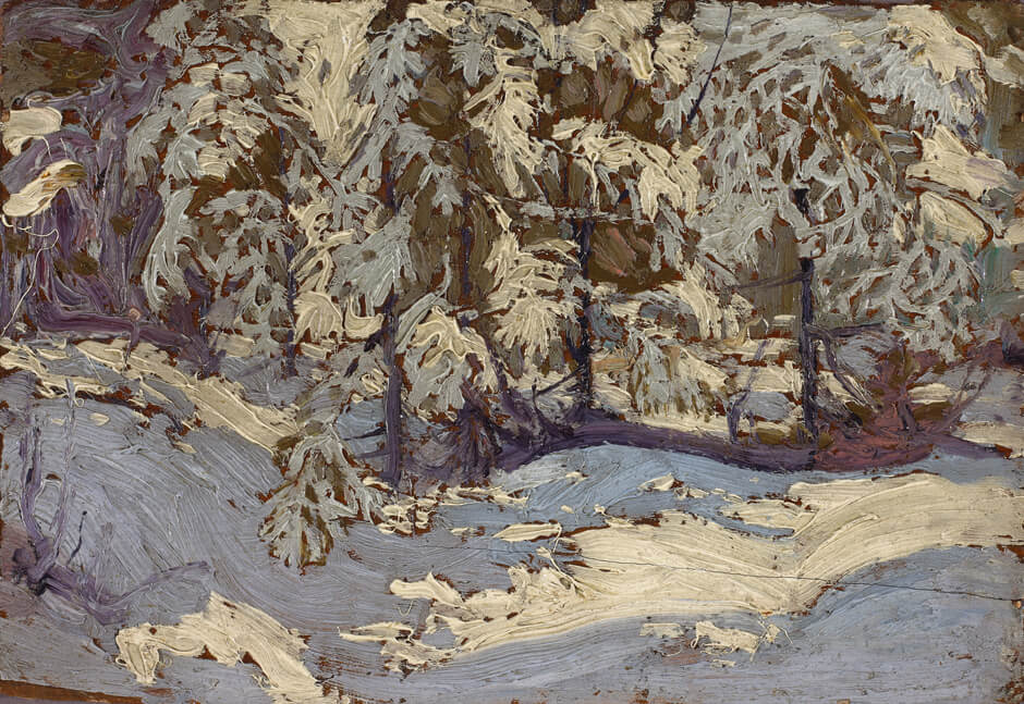
Thomson was moved to record the first snow of the winter, probably in late October or early November 1916. He did so in a way that turns these few square centimetres into a maelstrom of pigment that is at once tightly organized yet almost chaotically in motion.

In First Snow in Autumn, by omitting any sense of finish or tidiness, Thomson achieves the freedom he had been working toward over the previous three years. Judging by his work during his final year, his all-consuming objective was to express emotion and passion. The issues of scale and artlessness—of making the act of painting look simple and casual—were also stirring in his work. Just a few weeks after he painted this little image he began work on ten large canvases, a daunting ambition.
In this tiny painting, with just three basic colours (white, a mixed blue-grey, and a strange blend of browns that is sometimes greenish and sometimes deep orangey-grey), Thomson creates a radiant gem that is animated throughout. The painting has depth too, the scene is distinct and specific, and his sense of accuracy underlies a painted surface of compulsive, obsessive improvisation.
Close inspection reveals how skillfully it is painted and how, at its core, it is almost an abstract work of art. In its thick application of paint and seemingly reckless brush strokes, the sketch is reminiscent of Pine Trees at Sunset, 1915. The order within it, however, foreshadows the “action” paintings of Willem de Kooning (1904–1997), while the freedom with which the paint begins to flow reminds us of the much later and larger canvases of Jackson Pollock (1912–1956).
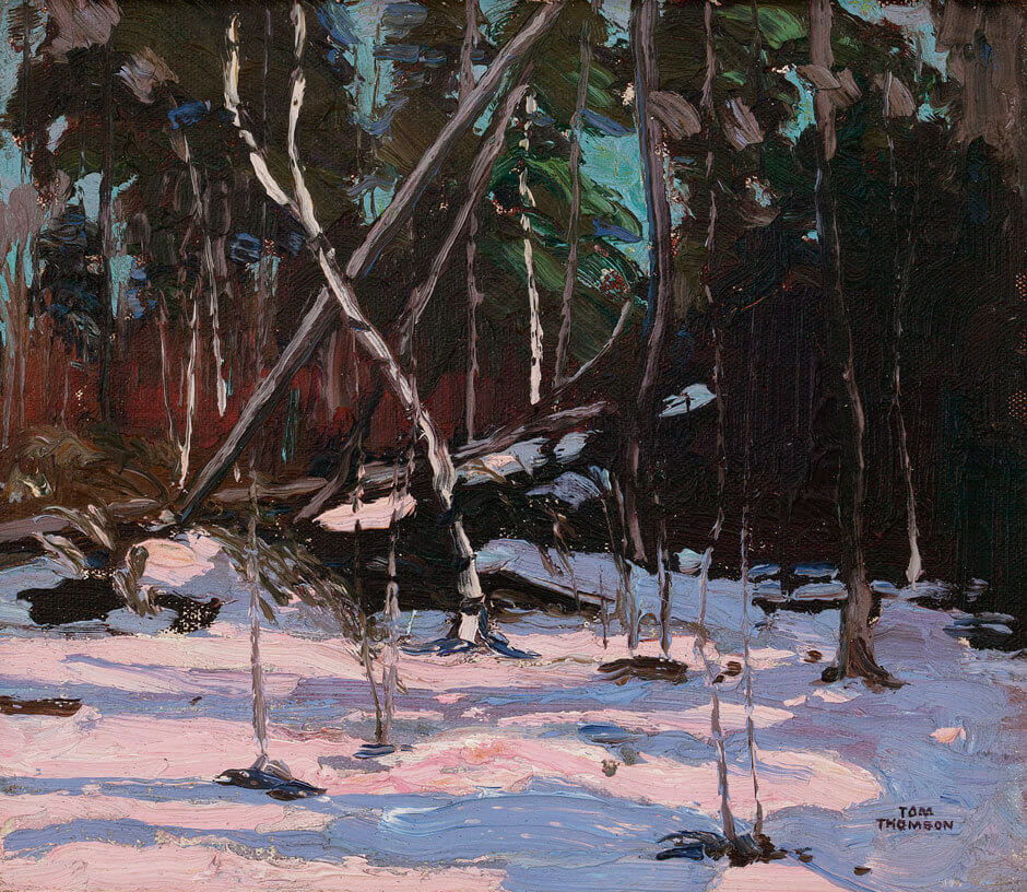
Painted at about the same time as First Snow in Autumn, the oil sketch Early Snow, Algonquin Park deals with the phenomenon of winter in quite different ways. It presents a forest scene (with a fallen tree providing a dramatic diagonal element) that is unusual and important because of the way it is painted. Pink light stretches across the snow in the foreground—a daring and unexpected colour made more prominent by the darker screen of trees that set it off. Grey-blue shadows join with the pink in forming a strong band across the foreground. To ensure that viewers accept these “unnatural” colours, Thomson used another odd colour—a flashy turquoise—for the sky.

 About the Author
 More Online Art Books
 Acknowledgements