Hiroshima Cover illustration 1946

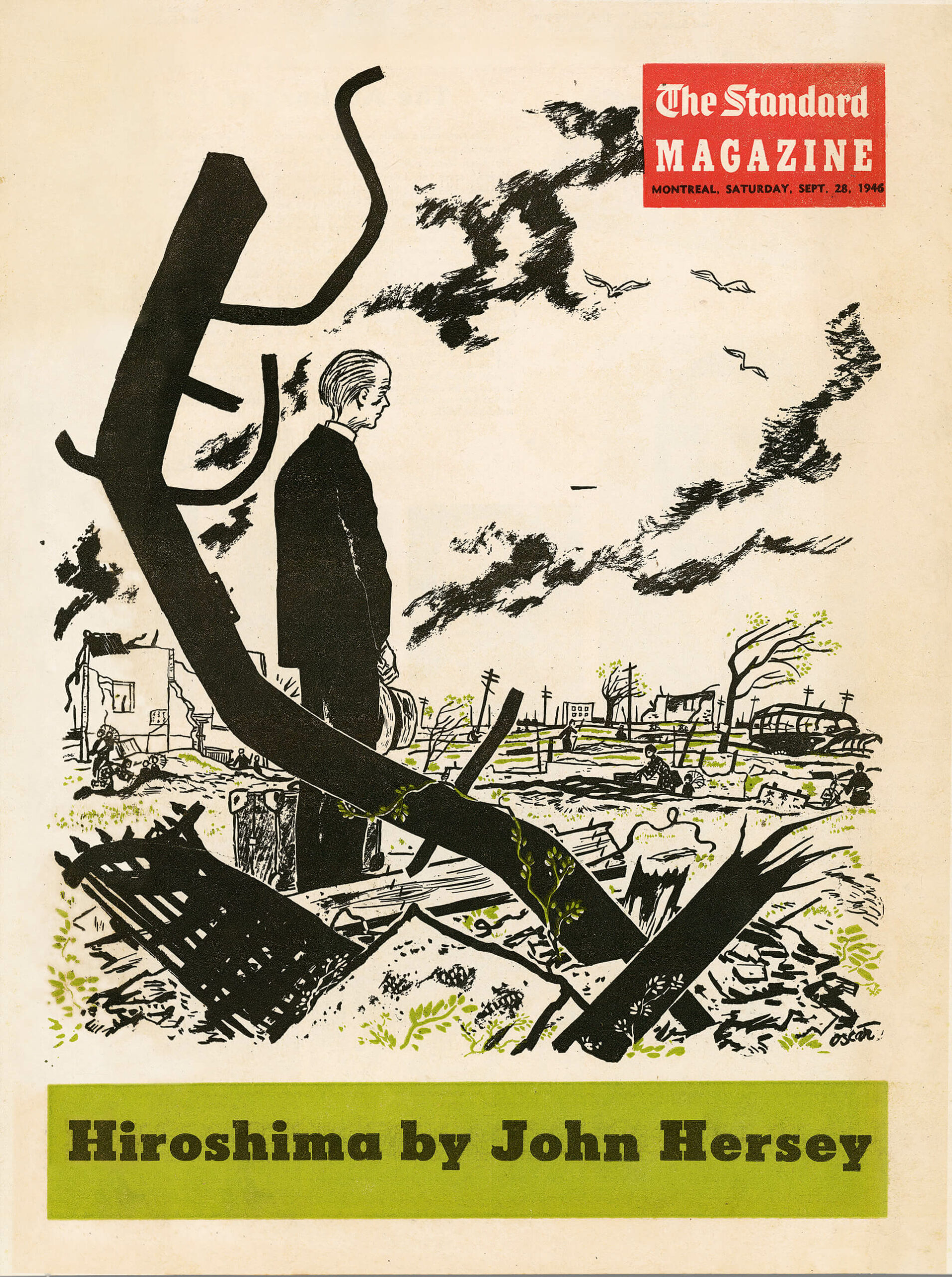
Oscar Cahén, Cover illustration for Hiroshima by John Hersey, published in The Standard magazine, September 28, 1946
Tearsheet, 40 x 30 cm
Location of original art unknown

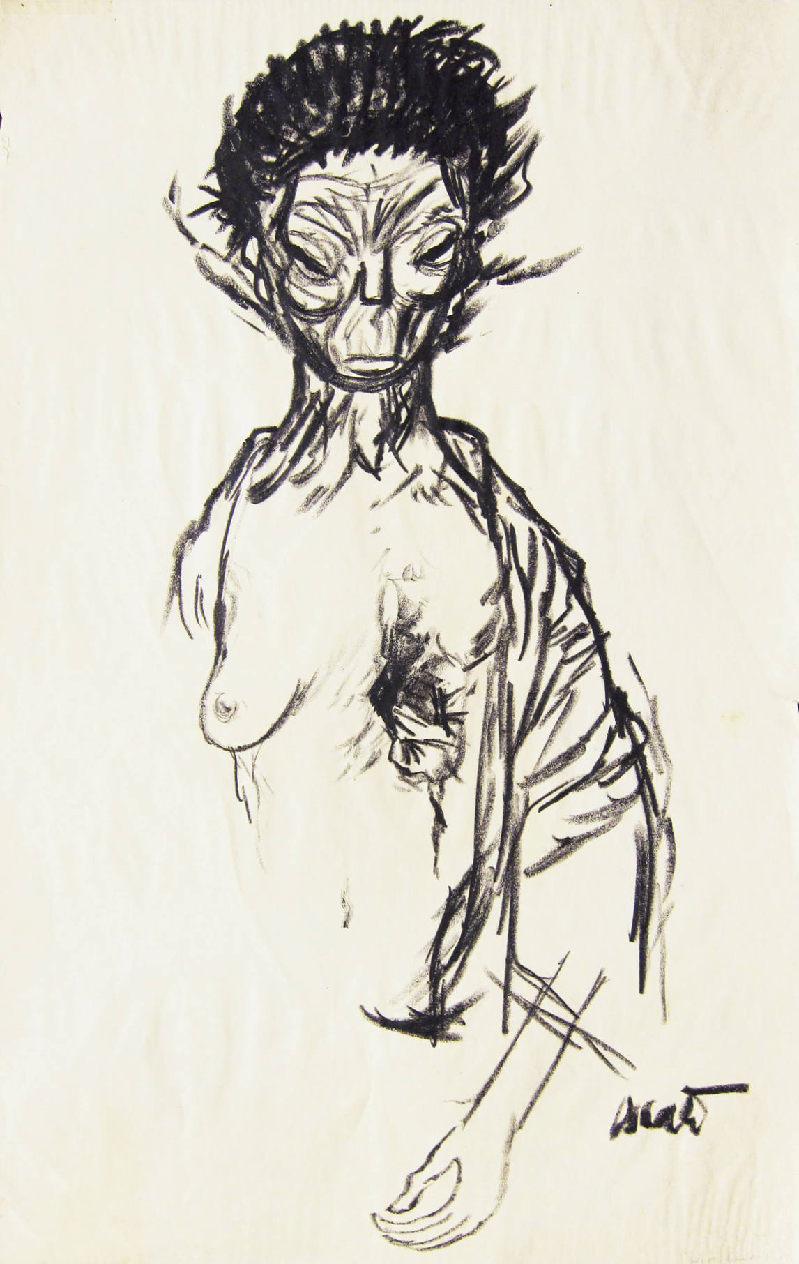
Because of his experience as a refugee, Cahén was often asked to illustrate war-related stories. Journalist John Hersey’s recounting of Hiroshima’s obliteration by nuclear attack on August 6, 1945 (first published in The New Yorker) describes the suffering of civilians from radiation in grisly detail. In what may be a research sketch, illustrated here, Cahén drew a horrifically injured woman. But Hiroshima required a treatment suitable for the newspaper’s general audience—“Not too much blood, please!” the client pleaded. The illustrations also had to solicit sympathy for the victims—no small feat given that Japan was regarded as the deserving enemy at the time. Additionally, Cahén had to work in a style that would translate well in solid colours on newsprint.
Cahén chose to portray realistically proportioned figures free of caricature, rendered only in black line. The cover shows vulnerable people: an elderly man, hat respectfully held in his hand, and foraging women and children dwarfed by a wasted landscape. The menacing, abstract shape of twisted wreckage in the foreground not only indicates the force of the blast but also nods to Japanese woodcut design, where refined use of asymmetrical shapes to frame a scene and make an interesting formal composition is esteemed. Similar devices appear later in Cahén’s abstract works.
Hiroshima was a major commission, including an additional fourteen spot-illustrations of survivors, wreckage, and rebuilding efforts, and four decorated capital letters. When the American literary agents saw Cahén’s work, they wrote him to say that of all the illustration done for the eight hundred publications of Hiroshima worldwide, Cahén’s were their favourite.

 About the Author
 More Online Art Books
 Acknowledgements