Greg Curnoe’s artistic influences ranged from comic books to twentieth-century modernists. In the works of Marcel Duchamp (1887–1968), Francis Picabia (1879–1953), and Kurt Schwitters (1887–1948), he discovered anarchism, text, collage, found materials, and assemblage. He drew inspiration from the artists Henri Matisse (1869–1954), Robert Delaunay (1885–1941), and Cornelis “Kees” Van Dongen (1877–1968). Curnoe’s use of highly keyed colour and text remained constants throughout his career as he made art out of the “stuff” of his daily experience.
Dada Remixed
Greg Curnoe’s earliest, most enduring artistic influence was probably comic books. As English professor Ross Woodman noted, “His childhood was shaped by comic magazines: Mickey Mouse, Goofy, the Shadow, Plastic Man, Captain Marvel were his favorites.” His natural drawing facility led him to create his own cartoons and comic books, such as Dutch Dill Pickle, c. 1948.
Curnoe adopted the cartoon style of bright primary and secondary colours with no modelling of the shapes, as well as the combining of words and images and juxtaposing of complementary colours to increase their intensity.
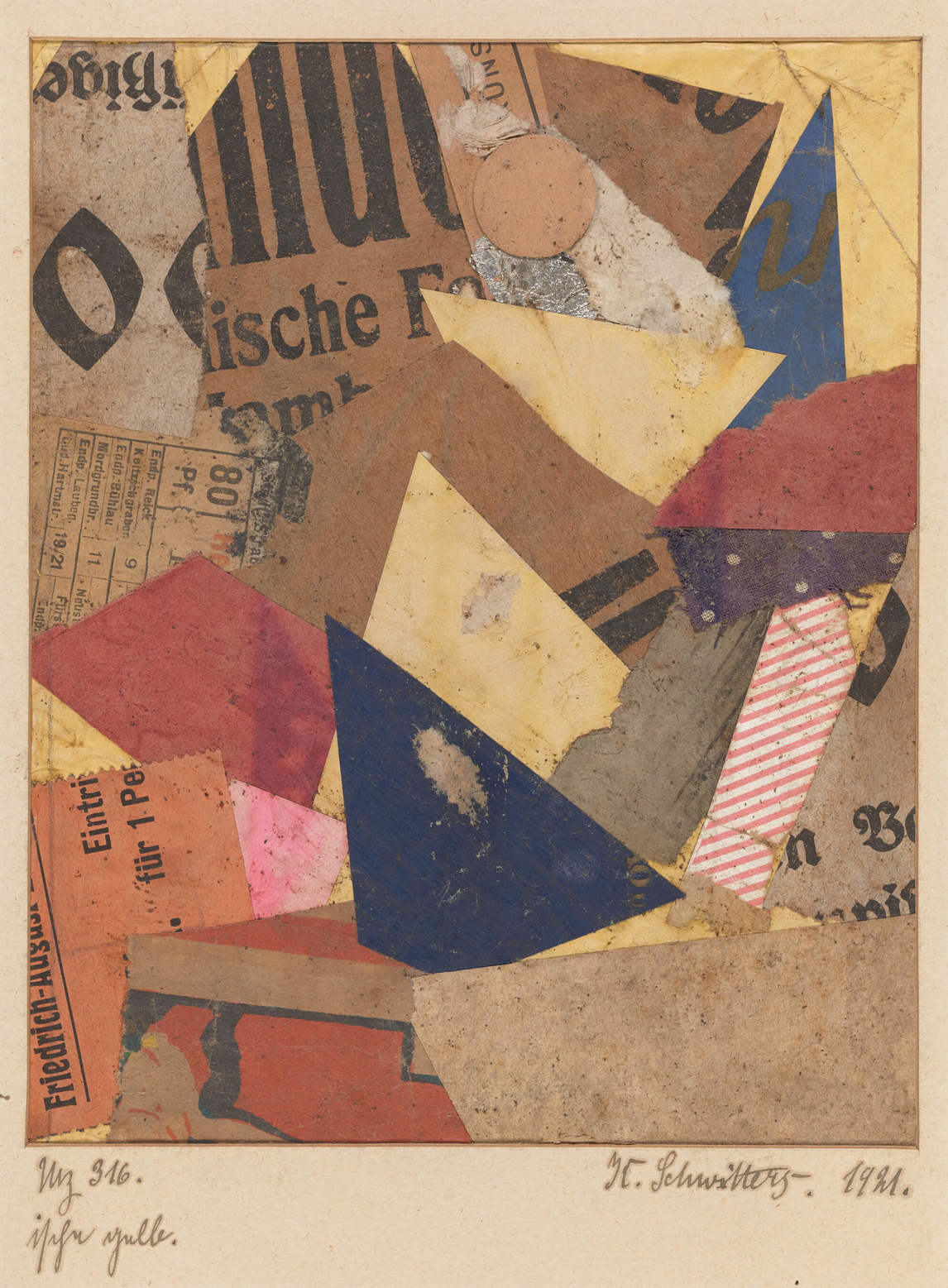
In 1954 in the Special Art Program at H.B. Beal Technical and Commercial High School, Curnoe first learned about Marcel Duchamp and the Dadaists and read László Moholy-Nagy’s book Vision in Motion (1947). He would have noted the famed Bauhaus professor’s linking of image and text, as well as his belief in the interconnectedness of art and life. Another important resource, which he first read in 1957, was the famous The Dada Painters and Poets: An Anthology (1951) by artist Robert Motherwell (1915–1991), with its images and texts by and about Duchamp, Kurt Schwitters, and Francis Picabia. He was attracted to the Dadaists’ use of found objects, assemblage, text, and collage, as well as to the anarchism, the humour, the element of chance, the anti-war sentiments, and the emphasis on Conceptual art.
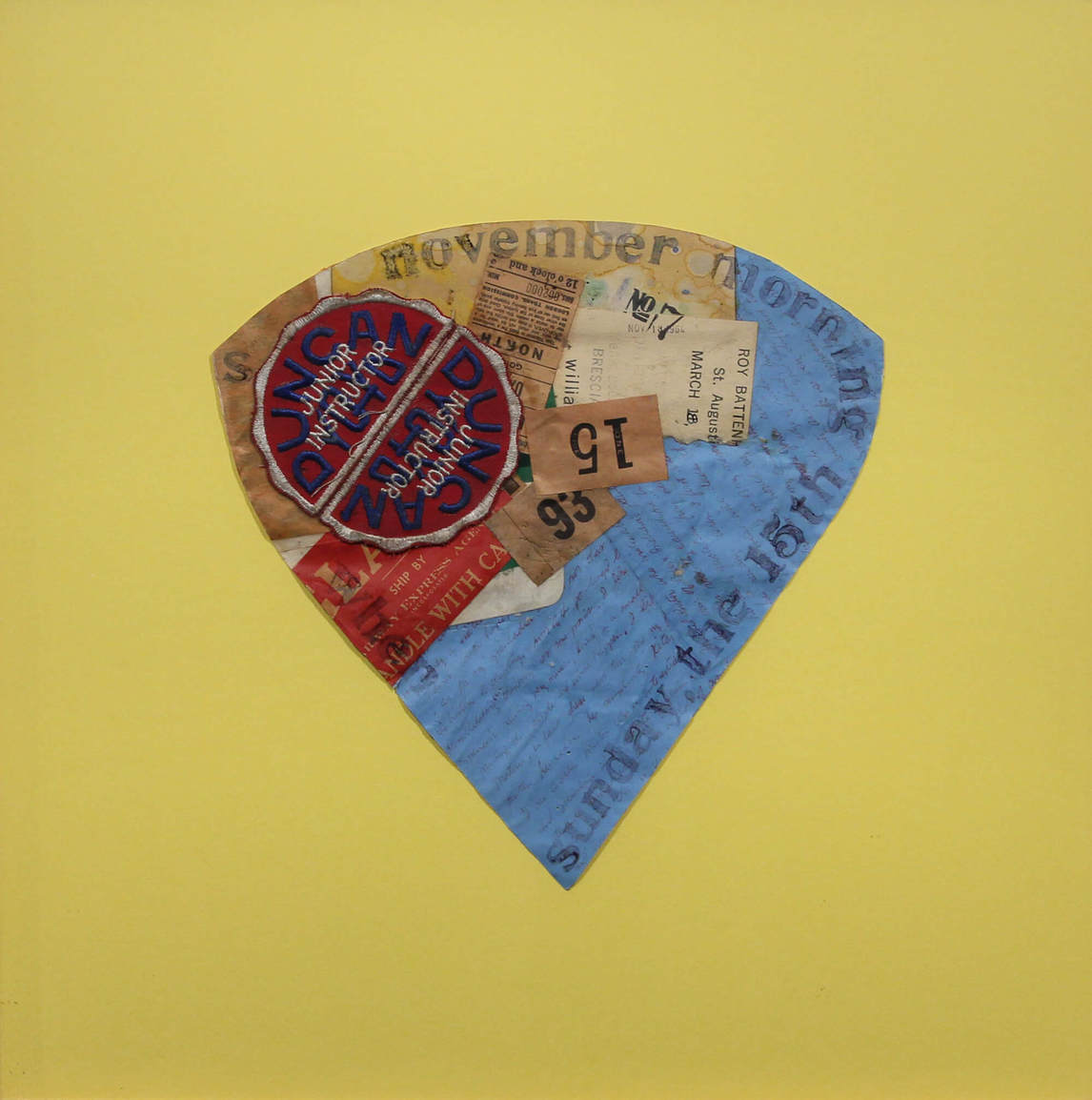
As early as 1961, following in the Dadaist tradition, especially of Schwitters, Greg Curnoe began to collage or glue ephemera from his life—bus transfers, labels, detritus picked up on the street, old cheques, comic strips, newspaper clippings—onto variously shaped pieces of paper. He then added rubber-stamped or stencilled texts.
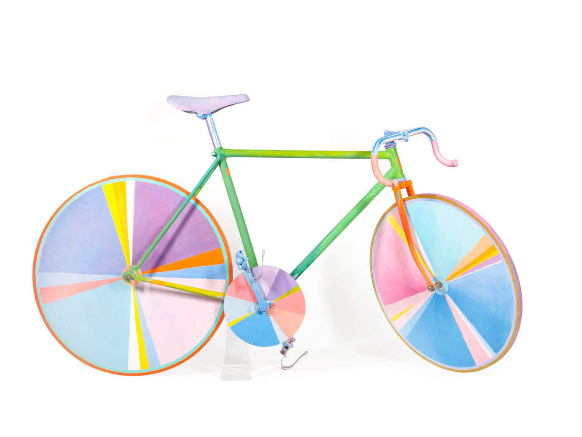
In fact, Dada was a pervasive influence throughout Curnoe’s career, from Drawer Full of Stuff, 1961, to his last full-sized bicycle portrait, Funny Bicycle, December 1985–May 20, 1986, an assemblage of a real bike frame with painted wooden wheels, a non-functioning bicycle.
Pop art had roots in Dada, so it is not surprising that Greg Curnoe’s work has been included in Pop art exhibitions, most likely because of his inclusion in art critic Lucy Lippard’s classic 1966 book Pop Art. She noted, “Greg Curnoe’s main connection with Pop Art is his flat rendering of figures and the frequent but unobtrusive ‘caption’ across the top.”
Curnoe was in fact working with many of the elements of Pop art—bright colours, text, comic strip–style figures, and familiar “things”—before Pop art was generally known. Art critic Gary Michael Dault noted his quite different approach: “Pop artists paint universal, generalized, and frequently banal objects. Curnoe, by contrast, paints the local, personal, and absorbing objects and events that make up his life . . . That isn’t Pop. It’s Curnoe making his own interests public.”
Words, Words, Words
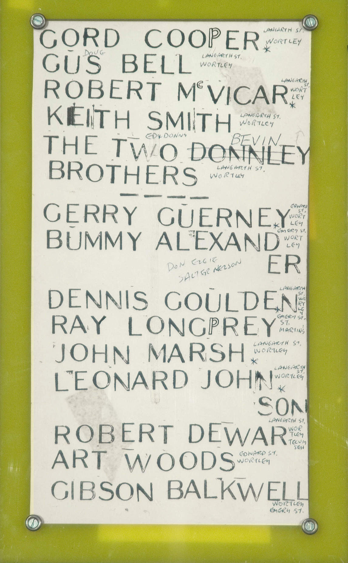
Greg Curnoe’s interest in text goes back to his childhood, when he was given a rubber stamp set as well as small rubber letters that were set in a wooden three-line holder. He produced occasional newsletters with his cousin Gary Bryant, who had a drum printing press. Curnoe also experimented with date stamps discarded from his father’s office. He explained, “It was so natural for me to associate type and text with a picture. And I quickly learned there are things you can do with a text that you can’t do with a picture.” As a result, there are few works in Curnoe’s oeuvre that do not include text of some kind. The discovery of the Dadaist use of text reinforced his childhood interest, but Curnoe used text in his own idiosyncratic way.
In 1961 Curnoe bought a new rubber stamp set, the first of many sets with uppercase letters that he used over the years. His early stamped works were lists: for example, lists of names of boys he grew up with. These were often very simple—black words stamped from individual letters combined with “found” texts. He also began the practice of making unique artists’ books, creating over a dozen from 1962 to 1989.
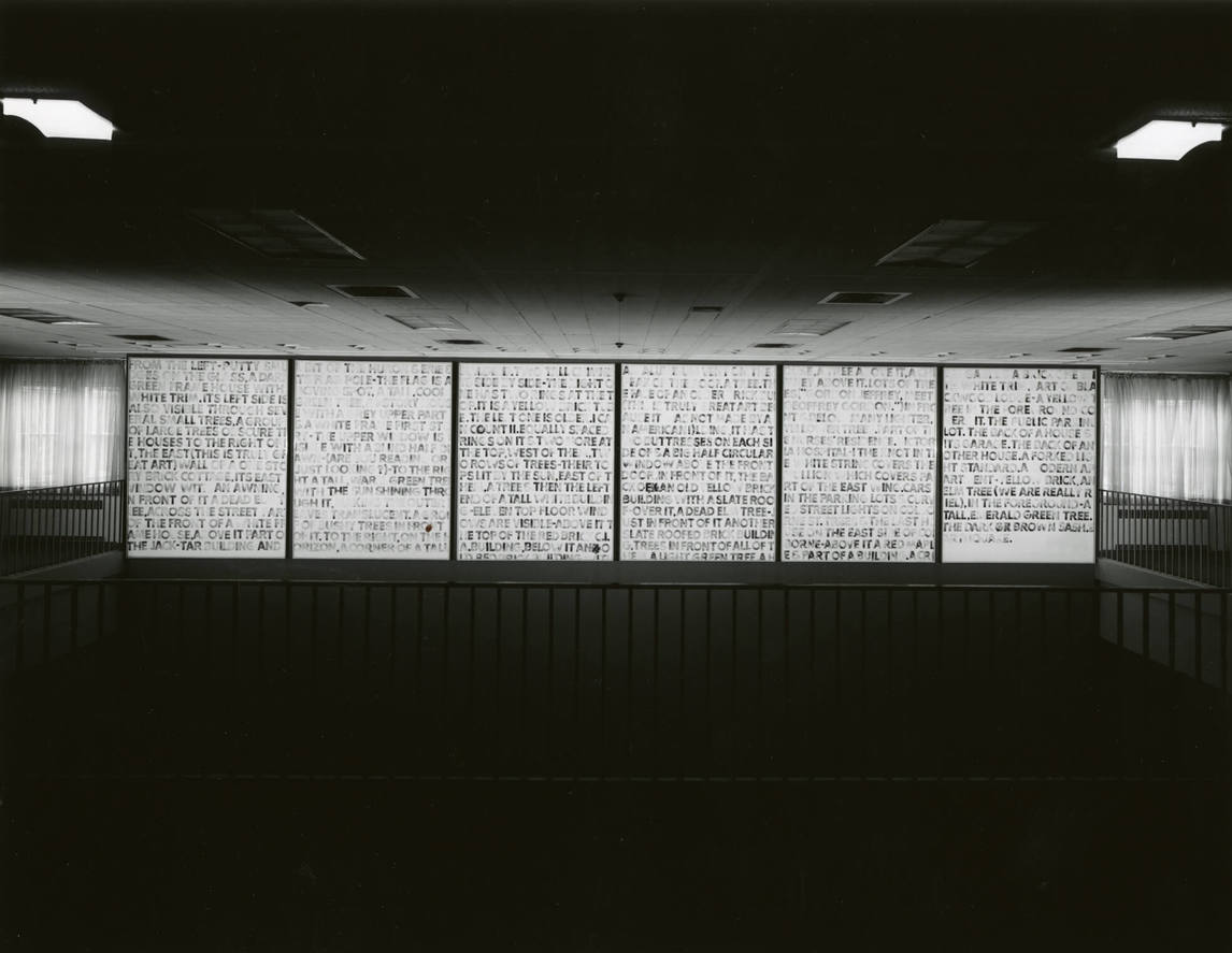
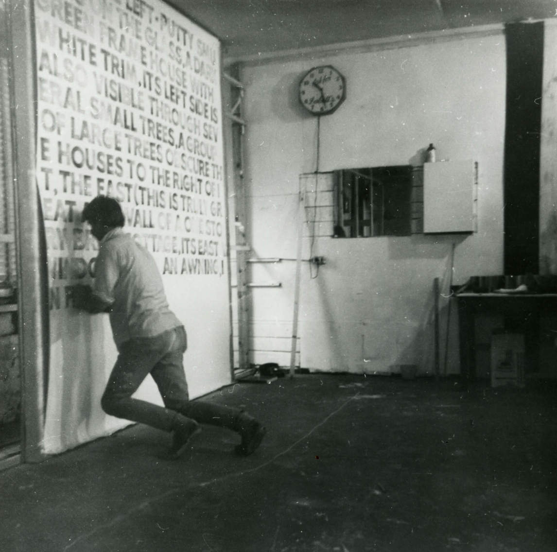
In 1968 Curnoe stamped the monumental six canvases of View of Victoria Hospital, First Series: #1–6. As art critic John Noel Chandler noted, the significance of this text series cannot be overstated: “Perhaps what is most novel and striking about what Curnoe has done is that by portraying the physical landscape with words, which are more abstract than pictures of things (at least in a phonetic language like our own), while at the same time making his language as simple and concrete as possible, Curnoe has accomplished the very interesting paradox of making pictures which simultaneously are abstract and concrete, making one reconsider the value of the dualism.”
Text in Curnoe’s work was stamped, stencilled, embossed, or handwritten, with the break in the lettering determined by the size of the support. Curnoe explained, “I discovered that a sans serif typeface isn’t as legible as the more traditional serif faces. In other words, the letters stick out, they don’t disappear. It makes you look and read at the same time.”
Curnoe was himself an omnivorous reader, and he amassed a large library over the years. Poetry anthologies and exhibition catalogues vied for space with atlases, novels, art books, and catalogues of bike parts. A novel that had a lasting influence on his work was The Voyeur (1955) by French writer and filmmaker Alain Robbe-Grillet, whose emphasis on precise language with an absence of metaphor was the literary equivalent of the visual style Curnoe was developing in the early sixties. Curnoe noted: “It is still one of my favourite novels and served to confirm my interest in using simple language and simple direct description.”
The two views of Victoria Hospital are excellent examples of Robbe-Grillet’s influence, with their straightforward description—one in words and one in imagery with accompanying text—of the hospital directly across the river from his studio.
Razzle-Dazzle Colour
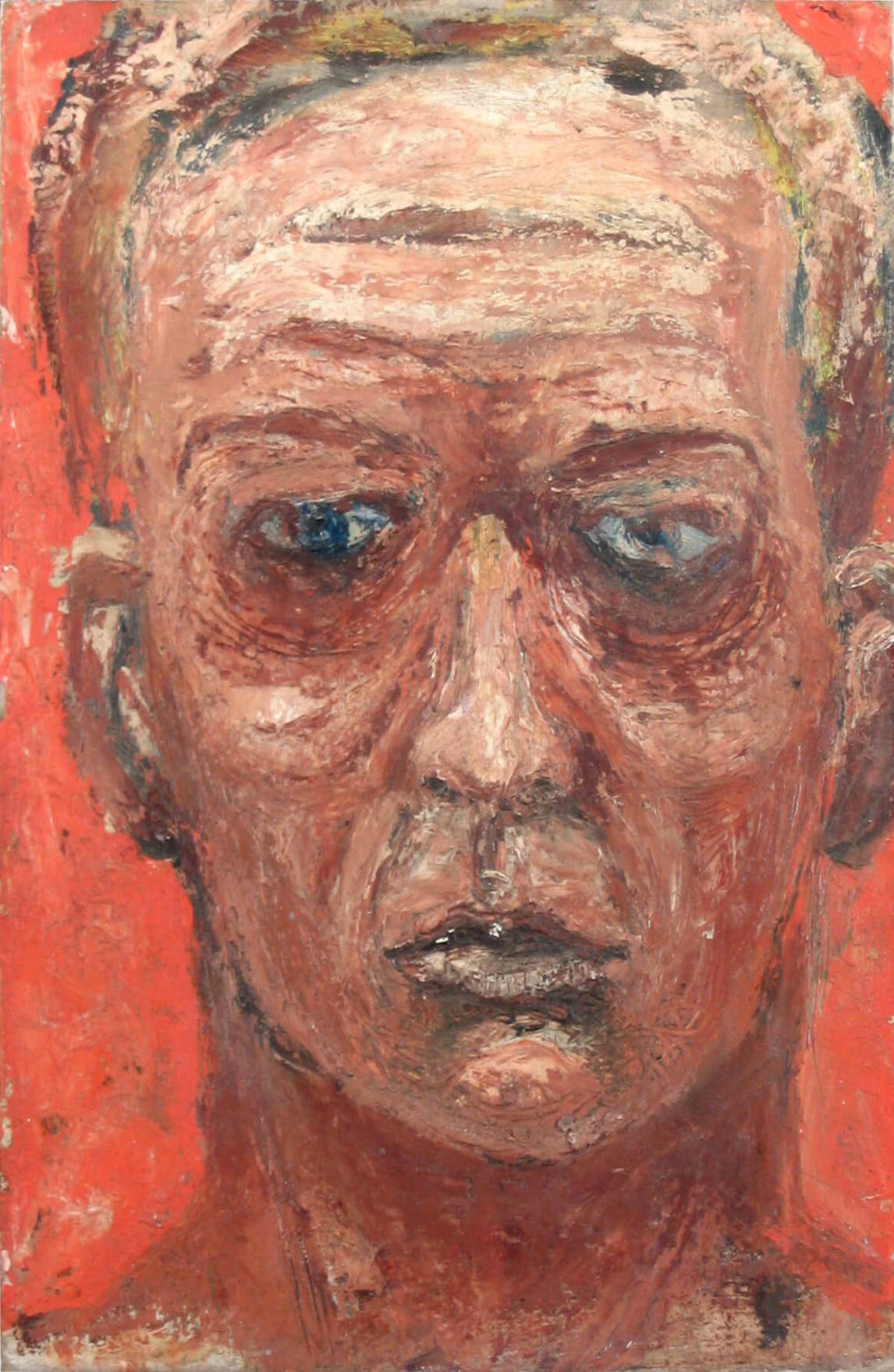
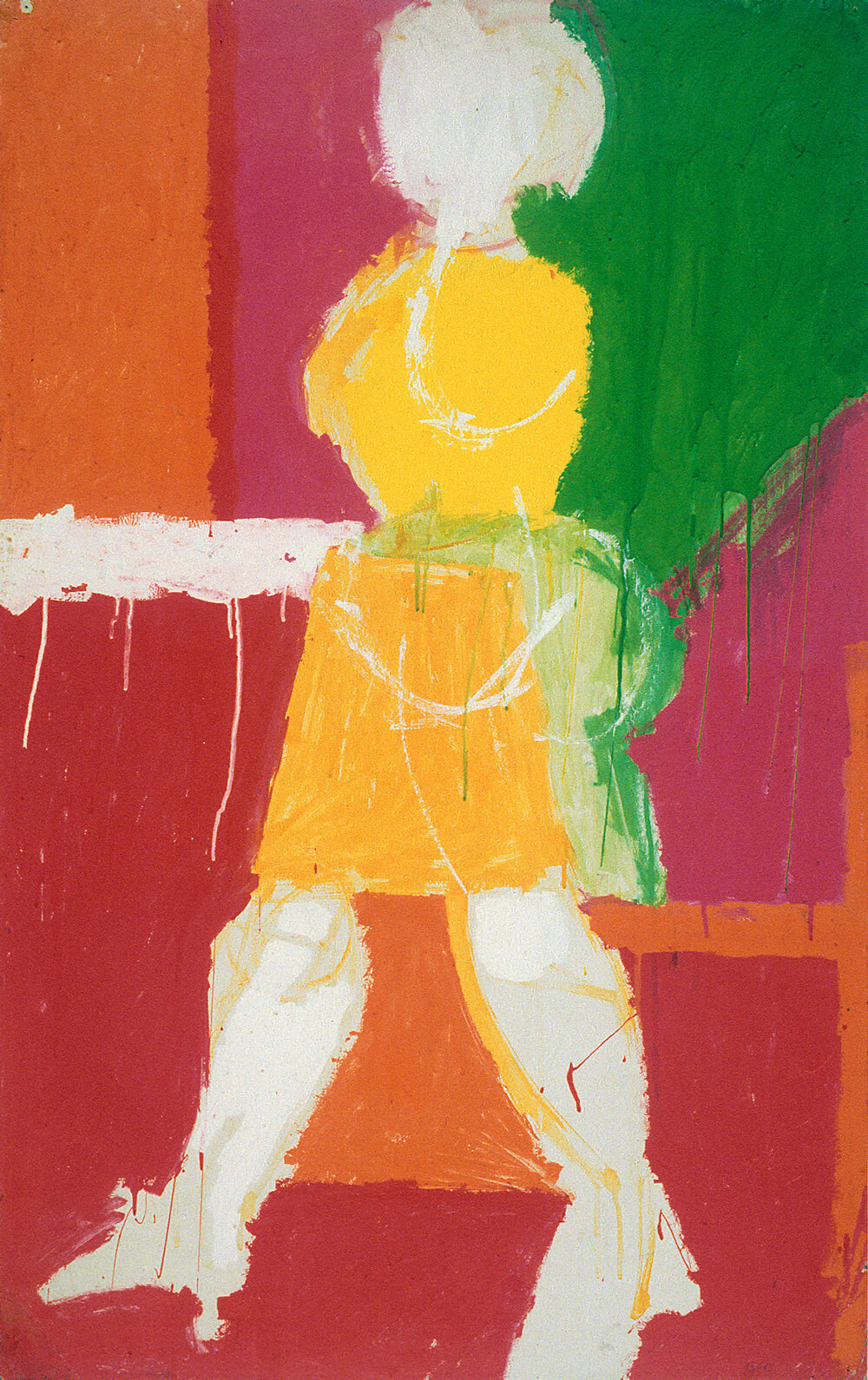
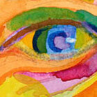
This virtuosity is astonishing considering that Curnoe was slightly red/green colour blind. He would not have seen the world in grey, as is sometimes assumed, but he might have had difficulty distinguishing one colour placed on top of another. As a result, he may have used the technique of placing bright colours in adjacent but rarely overlapping areas as a conscious strategy to see them clearly. When one thinks of Greg Curnoe, it is colour—saturated, intense, and insistent—that often first comes to mind, no matter the medium. Curnoe became a master of the application of pigments, usually very bright, be it fluorescent or other industrial paint, oil, acrylic, watercolour, or pastel.
His paintings before 1960—for example, the 1956 Self-Portrait—tend to be monochromatic and duller than his subsequent work, such as Girl, c. 1960. Stamping black ink on collaged ephemera or on a monochrome background, as in The True North Strong and Free, #1–5, 1968, or Deeds #5, August 19–22, 1991, might have been another form of accommodation. His admiration for the work of Montreal painters Guido Molinari (1933–2004) and Claude Tousignant (b. 1932) could be partly due to their use of bright, non-overlapping colours.
Over the years, Curnoe became knowledgeable about pigments. He researched their origins, captivated by the romance of names such as Bremen blue and Vienna lake. He also understood colour theory, using complementary colours to great effect, particularly his favourite blue and orange combination. Artist Robert Fones (b. 1949) observed: “For Curnoe . . . pigments provided a ready-made alphabet with universal and local associations.”
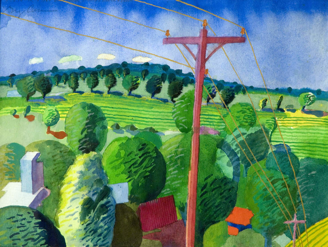
Greg Curnoe’s mastery of the watercolour medium is undisputed. He most likely learned the technique at art school and continued to paint small watercolour landscapes throughout his career. He applied the bright transparent colour to dry paper, a good choice for on-the-spot sketches while travelling.
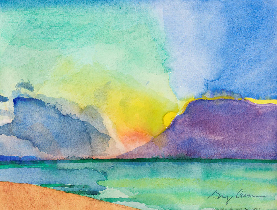
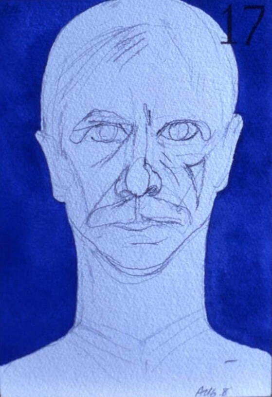
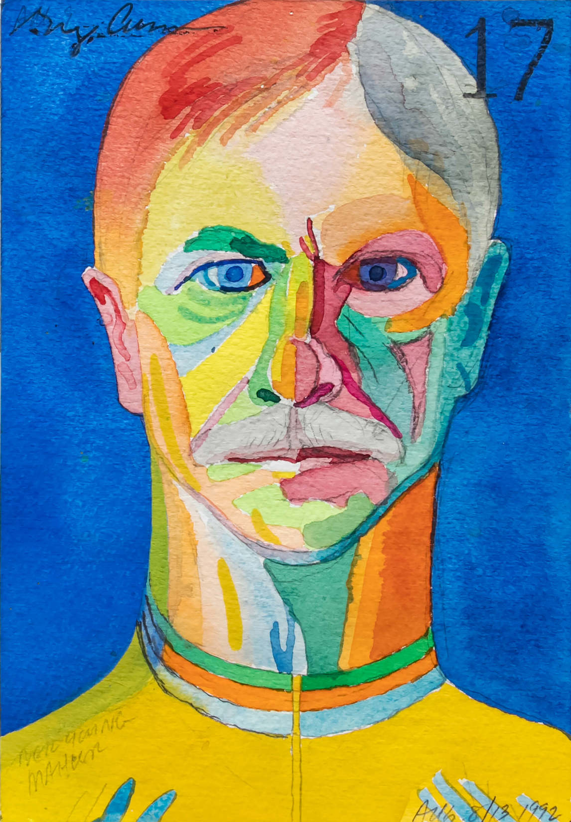
Sometimes Curnoe’s use of colour was straightforward, but at other times he made unusual choices, such as in a series of twenty self-portraits created in the summer of 1992. In the image of a work in progress, Self-Portrait #17, we can see that Curnoe began by sketching the broad outlines of his head and face in pencil and dating the work. Next he brushed on the blue watercolour background and stamped the number 17 at the top right before filling the drawn areas with arbitrary colour, including his favourite orange, yellow, and blue.
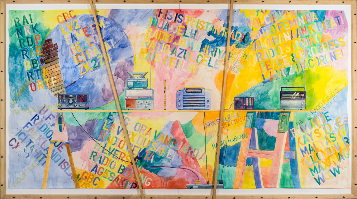
For large works, Curnoe had originally used paint on a wooden support, but in 1973 he switched to watercolour for the first of ten large-scale bicycle portraits. These were risky undertakings, as watercolour cannot be painted over in the event of a mistake and large paper is expensive. He produced several other large watercolours, including Homage to Van Dongen #1 (Sheila), June 27, 1978–November 23, 1979, but his largest watercolour is the magnificent Short Wave Radios on Long Board, 1987. This inspired commission by Blackburn Radio Inc., a London family-run business with radio stations all over “Souwesto,” drew on Curnoe’s long-standing interest in radio and is a superb example of Curnoe’s sensuous swirling colour.
Constantly innovating and experimenting, Greg Curnoe chose whatever style, medium, or technique would best express his ideas. His oeuvre, defined by his life experience and rendered with superb technical virtuosity, remains a testament to a life lived creatively, a life in which art was life and life was art.
 About the Author
 More Online Art Books
 Acknowledgements